Our Top ‘Color of the Year’ Picks & How To Use Them Around Your Interiors
A version of this article originally appeared in Frisco Style
Each year, Pantone color services releases its ‘Color of the Year’, which is a prediction of the colors that will flourish throughout 2023. Consequently, many paint companies follow this announcement, claiming their favorite tones. Regardless of whether you like them or not, the hues are valuable to pay attention to, and not just to use as “paint on your walls”, because they will appear throughout the multiple industries in our marketplace. Be watchful for these colors to show up prominently in apparel, cosmetics, small appliances, automobile paint and in home design elements such as blankets, pillows, and accessories.
Bold & Bright Tones
Nicole Arnold Interiors loves a good jewel tone – and recently recommended our favorite Sherwin Williams’ selections to accent our neutral base colors in our Nicole’s Neutrals : Winter 2023 Edition blog! We were thrilled to see Pantone and Benjamin Moore’s selection of bright pink and red tones – perfect for Valentine’s Day!
Viva Magenta
PMS 18-1750
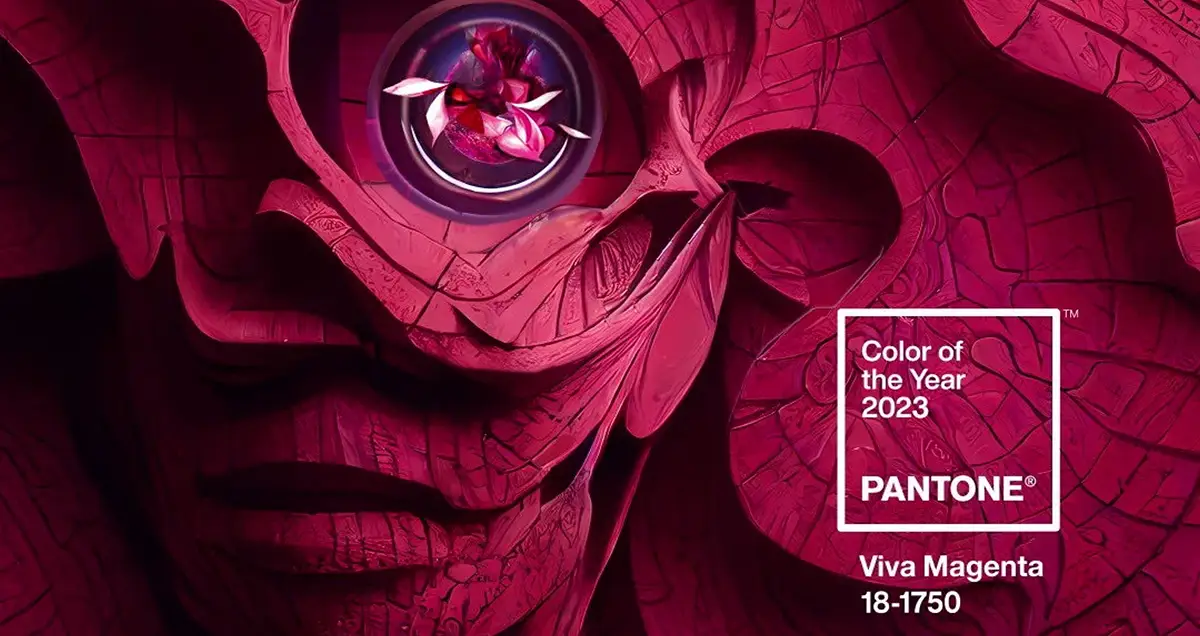
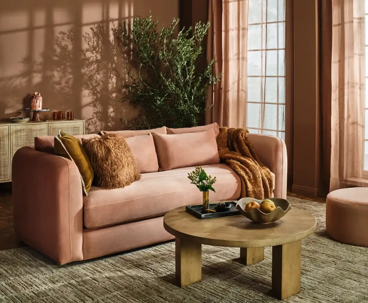
Viva Magenta 18-750 is Pantone’s 2023 Color of The Year and was chosen as a symbol of joy, empowerment, and boldness. We believe it’s a great color on accent pieces (pillows, draperies and rugs) throughout your home. It can add a compassionate energy to any room and compliments your home as the seasons change.
Image Courtesy Frisco Style
Raspberry Blush
2008-30
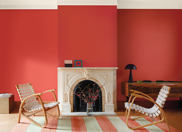
Benjamin Moore’s Raspberry Blush 2008-30 is another gorgeous tone that we’re thrilled to see as a pick for 2023. It is described as a “vivacious shade of coral tinged with pink” and an “electric, charismatic hue.” The color exudes confidence that pairs well with high contrast neutrals, such as white or blacks!
Image Courtesy Frisco Style
Where to Use These Two Bright Tones:
- In a butler’s pantry
- As an accent color in a wet bar
- On standalone furniture such as a side table, dresser, or entryway display
- As accessory décor in each room
Moody Hues
In contrast with the bright, up-beat tones, we enjoy using moody colors to add drama to a commercial or residential interior. Our favorites utilized blue and charcoal, rather than a traditional solid black.
Everglade Deck
5011-3
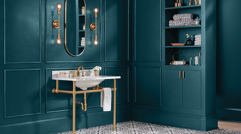
Everglade Deck 5011-3 is Valspar’s Color of the Year and is a deep, midnight blue that pairs well with brass accessories. It is described as a calming shade that promotes the trend of wellness around your space. We like it because it adds a bit of drama to walls and cabinetry and, with the right metallic or lighter colored furnishings, will look stunning. However, be cautious not to overuse this color without contrasting accent pieces or you may find yourself in a dark and uninviting space.
Image Courtesy Valspar
Where to Use:
- Bathroom
- Reading Room / Study
- Book Case
- As a feature wall
- Art pieces
Vining Ivy
PPG1148-6
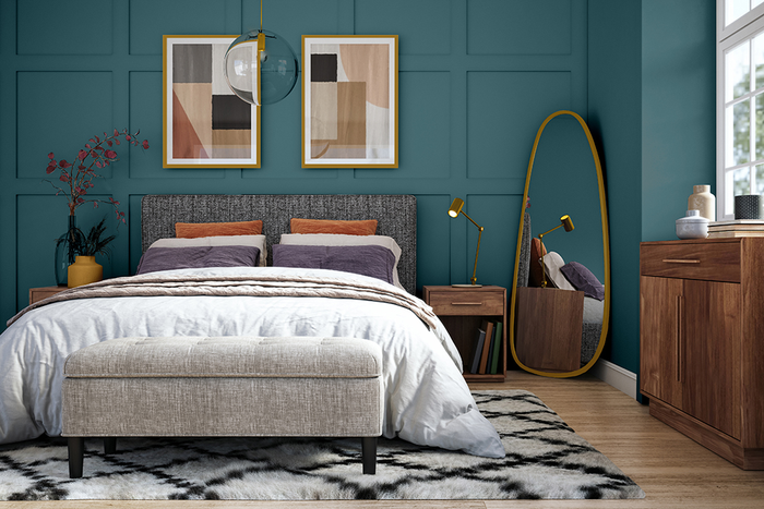
Vining Ivy PPG1148-6 is Glidden’s 2023 color that is meant to be both energizing and grounding. It’s a bright aqua shade that doesn’t overpower a room. Its muddy undertones allow for a bit of drama without oversaturation. It pairs very well with neutrals, adding depth and a subtle drama.
Image Courtesy Glidden
Where to Use:
- Bedroom behind a headboard
- Playroom
- Family room
- Home Office
- Sunroom
Darkroom
HGSW7083
Previously: Wild Ride HGSW3381
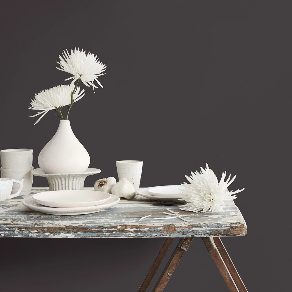
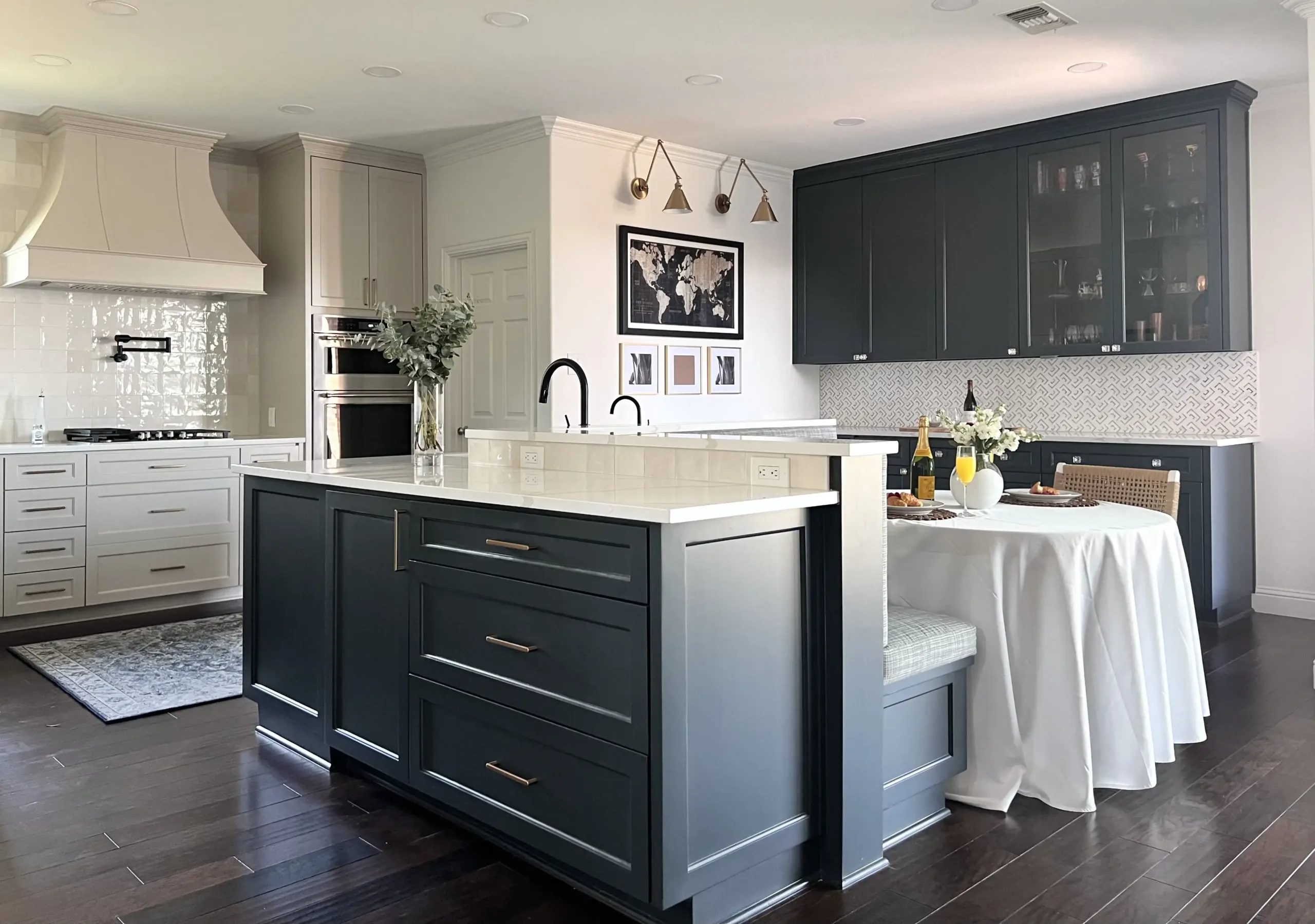
Darkroom HGSW7083 is HGTV’s pick for this year, as part of a collection by Sherwin Williams. The color is a warm charcoal that can modernize any room without the full darkness of a 100% black tone. This color can be featured well in a room with plenty of windows to balance its depth. Accessories or furniture in “darkroom” would serve as gorgeous, prominent punctuation marks amid a well-curated design.
Image Courtesy HGTV
Where to Use:
- Living Room accent wall
- Dining Room
- Kitchen Cabinetry
- In a Den or light-filled office
- Modern Décor
- Dramatic Drapery
When it comes to color, there are no absolute rights or wrongs…only the ones that evoke the emotions you wish to bring forward. Whichever colors you choose to run with this new year, be sure to incorporate the ones that reflect you and your goals for your space!


